Friday 29 July 2011

chris silas neal | blackout

"Carlos Alberto Torres arrived in New York on July 13 1977, in the midst of the blackout.
In this video, Carlos recollects his time in New York City." - chris silas neal

the kills | prince bandroom 2011

and so we meet again, alison. this would be the third time i've seen alison perform live - twice for the kills, and once for the dead weather. she is amazing. what i love most about her shows, is the vibe. the audience is very chilled - not bored, just chilled. no pushing or shoving, just a gathering of people with a genuine appreciation for her music.

a friend and i queried why the kills opt for a drum machine - we came to the conclusion that 'it just wouldn't work'. they don't need an extra member to have that band-like image - 'the kills' are alison and jamie. just like 'the white stripes' are jack and meg. alison mosshart and jamie hince have a unique and beautiful on stage presence; the chemistry is actually kind of heartwarming. they're not just a band, they're friends, and they're not afraid to express it on stage. i know, it seems like a simple concept, but i've been to enough shows to confidently say - some bands are quite ... how do i put this nicely? pompous. you don't get that with the kills. they love what they do, they love the music, and they appreciate their fans.

although they didn't perform black balloon and alphabet pony, which was a little disappointing, the things that made the show for me were - 1) alison's rickenbacker - this increased my 'i would turn for you' factor for alison, tenfold; 2) extended eye to eye contact with jamie - i mean, come on, who wouldn't want eye to eye contact with kate moss' husband. some would argue that perhaps he wasn't looking directly at me, but for the purpose of this blog, let's just say he did.


the lanterns on degraves st

i walk past these every morning on my way to work. yes, that street - every hipster's location of choice for a bite to eat, some shutterbug action, and a little mingling. perhaps it is an over-hyped street, but i still like it. back to the lanterns - they're an installation of some sort, so i'm not sure how much longer they'll be around. a while, i hope. i think they're sweet. a touch of innocence in an alley overwhelmed by graffiti. it's a visual contradiction. not that i dislike graffiti, but the transition is a pleasant change of scenery. bringing some much needed positivity to the lives of those heading back to the grind. i'm sure we've all felt that way at some point in our lives, so i hope everyone can appreciate this artwork as a sign that there is a light at the end of the tunnel, or in this case, the street.

ETA: i know the photos aren't top notch. so please excuse the slight blur ... i was in a rush.


Wednesday 27 July 2011

yes | owner of a lonely heart

move yourself
you always live your life, never thinking of the future.
prove yourself
you are the move you make. take your chances win or loser.

Tuesday 26 July 2011

bambi necklace

bambi necklace - monster threads. crocheted mushroom - sabahnur.
white birdcage - urban outfitters. white ceramic bottle of 5c quality milk - typo.


Monday 25 July 2011

melbourne design market | july 2011

made an appearance at the melbourne design market on sunday. a successful and productive market this year, in my opinion. the market generally stocks around 2/5 of the same stalls every year, which is a tad disappointing. begs the question, does the lack of accessible creativity reflect melbourne's artistic talent, or lack thereof? i've never really queried it - i am a proud melbournian and do enjoy the artistic culture and lifestyle of the city dwellers. perhaps it's more of a 'good things come to those who wait' situation. must be. that said, i'm pretty sure a majority of the stalls were selling non-australian designed or made products. back on topic, i managed to pick up the following: -
  • cards by able and game - these cards make me smile. we purchase these every time, so it only seemed fitting to ensure we lived up to the tradition. i do quite like the google card.
  • keepcup - great colour combination, eh? it reminds me of a watermelon. @alfalfasaysyes picked out the colours and we bought matching keepcups. can you feel the love?
  • great balls of wire - a nifty little gadget to keep all your wires in some logical order. great for OCD people, such as myself.
  • stock album - a petite photo album with pockets, for my instant fuji instax shots. i like the concept. the pockets also remind me of those old yellow pockets in school library books. i don't even remember the correct term for those anymore, it was that long ago.


Sunday 24 July 2011

hate is baggage

"So I guess this is where I tell you what I learned - my conclusion, right? Well, my conclusion is: Hate is baggage. Life's too short to be pissed off all the time. It's just not worth it.
Derek says it's always good to end a paper with a quote. He says someone else has already said it best. So if you can't top it, steal from them and go out strong. So I picked a guy I thought you'd like.
'We are not enemies, but friends. We must not be enemies. Though passion may have strained, it must not break our bonds of affection. The mystic chords of memory will swell when again touched, as surely they will be, by the better angels of our nature.'" - danny vinyard, american history x

blue in the facade

"Canada's Magdalen Islands offer a seaside retreat to landlocked Quebecers, two of whom have turned the local vernacular on its oreille with a winsome vacation home." - dwell


adidas high tops

i'm not usually a sneakers girl. although, that said - i do have around five pairs or so. i saw these in the kids section. and yes, i know - kids shoes are of lesser quality. but hey, if you can fit into them - why not? ... especially when you have a cheer leading routine to perform the following day. perfect reason to indulge in a new pair of sneakers. not to mention, the colours were quite fitting. purchase justified.


assemble the empire | dawn of the dead

dawn of the dead she said
"i feel so much brighter without you in my head"

Sunday 17 July 2011

john powers | fat bastard 2010

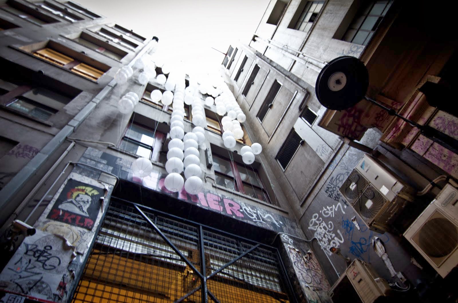
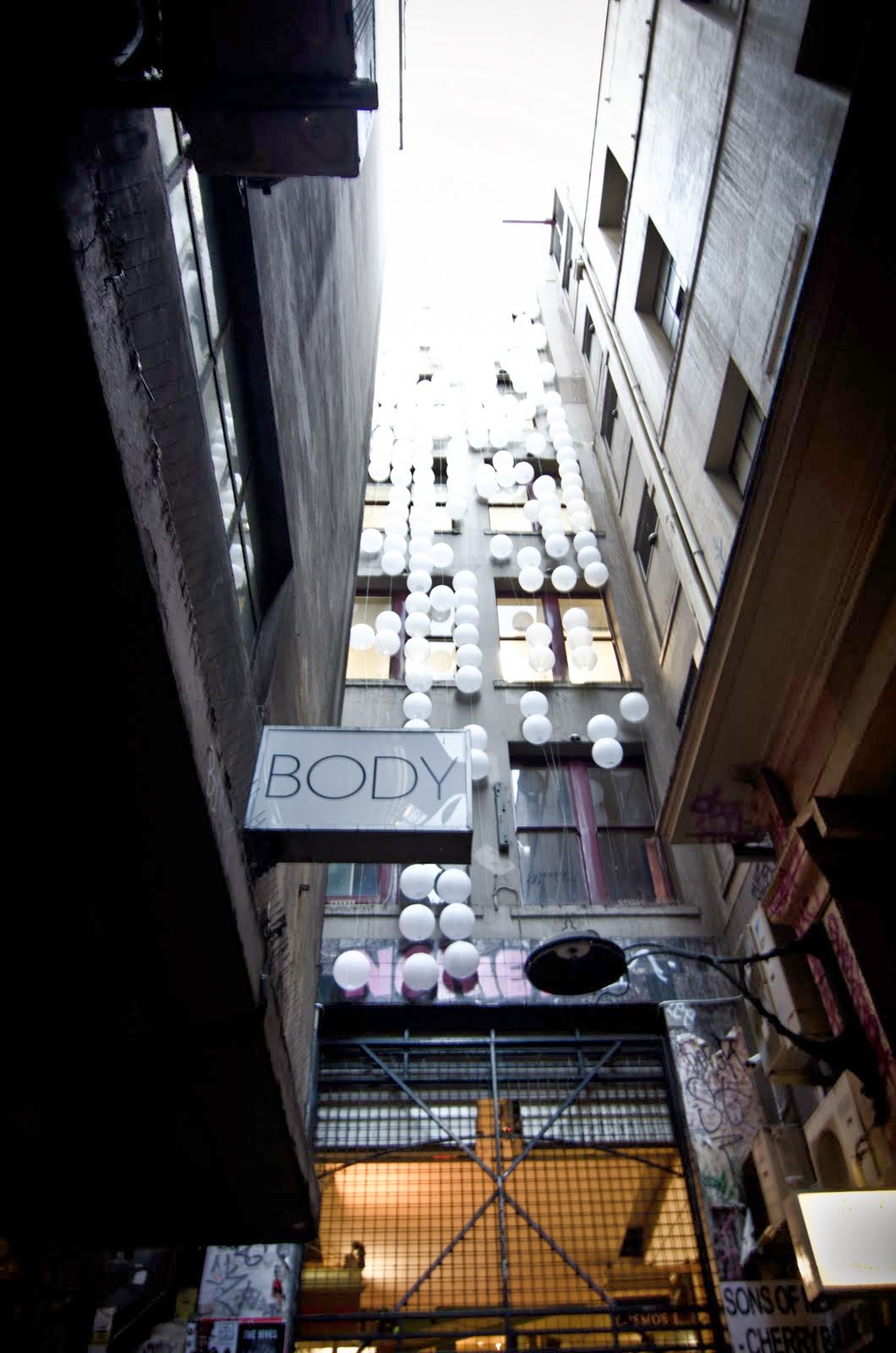
"The impenetrable geometries of John Powers’ abstract sculptures call to mind a wide range of influences, borrowing equally from art movements like postminimalism and pop culture icons like Star Wars. Meticulously constructed by hand, Power’s forms are constructed out of a limited formal vocabulary: Polystyrene blocks cut to a selection of preset sizes, attached to each other at 90 degree angles. The resulting structure gives the appearance of being a computer-aided design but is in reality the outcome of a human-executed algorithm, dictated by the artist’s intuition expressed through the repetitive action of connecting blocks." - NODE10


image source: Generator.x

vogue paris august 2011 | freja beha


image source: fashion_screen

Monday 11 July 2011

nanna van blaaderen | more or less

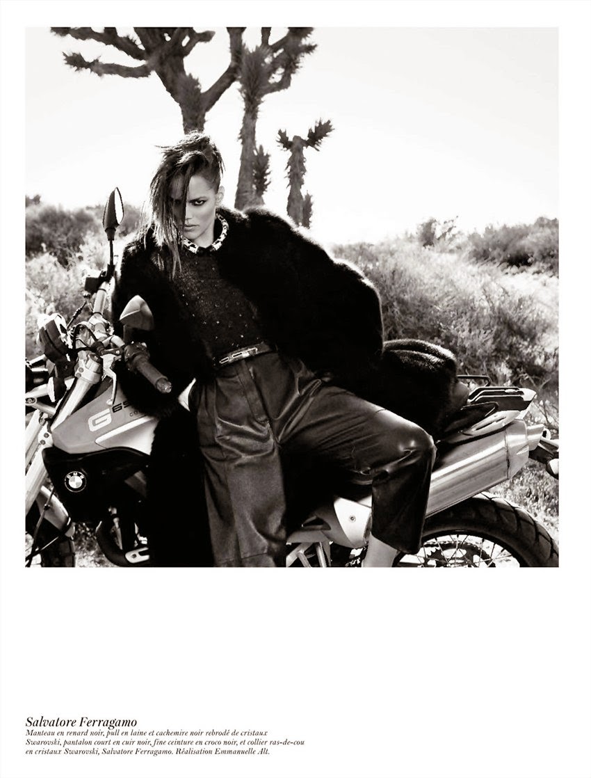
"The sculptural handknitted collection 'More or Less' is inspired by organic forms, animal life and nature. Using thick woolen yarns in off-white colors, Nanna van Blaaderen experimented in combining knitting techniques with braidingtechniques. This resulted in various expressive garments of voluminous structures and forms." - nannavanblaaderen.com

Sunday 10 July 2011

the strokes | taken for a fool

dana tanamachi | chalk art

"Dana Tanamachi is a graphic designer and custom chalk letterer who hails from the Lone Star State, but currently resides in Brooklyn, New York. She enjoys crafting, reading, walking, and especially listening to Country music from the 1990s.

In June 2008, Dana moved to New York City and began working at SpotCo designing posters for Broadway shows. Currently, she works at Louise Fili Ltd, a NYC-based studio specializing in logo, package, restaurant, and book design.

After hours, Dana moonlights as a custom chalk letterer, creating large-scale chalk installations in New York City. She also applies her chalk lettering to a wide variety of uses for publications, packaging, and apparel." - danatanamachi.com

mulberry fall 2011 | tim walker

tati cotliar & julia saner by tim walker


image source: fashion gone rogue